Data games - Instructor notes
A workshop comprised of four games, each followed by a mini-lecture that explains the key concept of data analysis illustrated by the game.
Farm race game (Normal distribution)
What is it?
Activity to demonstrate where the normal distribution comes from. Also revises basic histogram plotting and the idea of a distribution.
What do they do?
Students form groups by proximity / breakout rooms. Makeup of groups doesn’t matter, but no more than eight groups, and they should be of roughly equal size.
Each student has a laptop, on which they have gone to rolladie.net , and set it up for rolling 4 six-sided dice. They also go to menti.com and enter the code provided.
The class leader shows the farm race board, and the mentimeter poll results - example layout. Groups pick their animal in turn. When all on starting line, TA picks a student from each group in turn to roll dice, report score, and answer menti poll. Class leader moves corresponding animal that distance in cm (see rule).
First team over the line wins! There should be some kind of prize.
What data do we end up with?
Average throw is 4 * 3.5 = 14, so the average group will finish in 8 throws. With 6 groups, the likelihood is one will win more quickly, roughly 7 on average I think. So the group will end up with around 40 tally marks on the sheet, which should be just about enough to show a normal-like distribution. We’ll use this data in the mini-tutorial below.
End-of-exercise mini-lecture
Gather the groups together. Ask students whether any one number on a single fair dice is more likely than any other (it isn’t). Show them a likely tally chart for a single dice on this basis. Ask them to compare this with the tally chart for their race scores. How are they different? Why are they different? (They’re different because there’s only one way to get 24 or 4, but a lot of different ways to get middling sums). Make the point that when any number is the sum (or mean) of a bunch of different numbers, the sum will have approximately this distribution — whatever the distribution of the individual scores. This is why a lot of data relating to people has a normal distribution. For example, IQ scores are made up of scores on a lot of different tests, and the resulting average is normally distributed (in the non-brain-damaged population).
Exam bingo (Sampling)
What is it?
Practical exercise to demonstrate Law of Small Numbers (Tversky & Kahenman) - in other words, the tendency to draw strong conclusions on the basis of insufficient data.
What do they do?
Students do this game individually. They go to menti.com and enter the code provided.
The class leader shows the exam bingo board. The class leader starts revealing exam scores, one at a time, for the Red group, and the Blue group, in turn. Sample from the distribution spreadsheet - which the students should not see - without replacement.
As soon as students are sure they know whether Reds or Blues are better on average, they vote. Keep going until everyone votes. TA views the mentimeter poll results - example layout - but does not share these results with students until the end of the game. TA also keeps a record of how many people in total have voted at the end of each reveal of a score.
End-of-activity mini-lecture
First, it’ll be instructive to see the level of agreement about which is the best - Reds or Blues?
Second, reveal how many samples people took before answering (the data collated by the TA).
Ask how many samples they think they’d need to be fairly sure which group was better. The answer for this obviously depends on the level of certainty required, but standard power calculations indicate 25 samples per group (so 50 pieces of data) for 80% power at an alpha of .05 for the mean difference and standard deviation of these cards. 80% power is really the minimum that is acceptable in modern psychology.
Take home message: big samples are important.
What’s the distribution?
Red pot contains numbers sampled from a normal distribution, mean 62, sd 10; blue pot is mean 70, sd 10.
Construction of the card decks was assisted by an R script, which you
can find on this site’s github repository at src/sample-pots.R.
Praise and punishment (Regression to mean)
What is it?
Interactive demonstration of regression to the mean.
Interactive activity
Class leader plays web-based shove-hapenny where a penny moves along the screen and ends up in one of a number of scored regions (0 pts, 10pts, 20pts, 100pts, 20pt, 10pts, 0pts - the 100pt region is quite small). Game is presented to students as a game of skill, where how long the key is held down for affects how far the penny goes. This is not true, the distance the penny travels is sampled from a random normal distribution.
Students’ roll is to praise/criticise the class leader on the basis of their performance. Each time class leader lands on 100pts, the class say ‘well done!’ enthusiastically. The TA records whether the CL does the same or worse next time, using the tally sheet.
Class leader gets 30 goes. Then, the students switch to criticizing. The feedback this time is to say ‘YOU SUCK!’ each time the CL scores 0pts. TA records whether CL does better or same next time. Class leader again gets 30 goes.
Post-activity mini-tutorial
TA’s tally sheet is shared with students, and we discuss what tends to happen after praise, and after criticism. You will find the CL does better after punishment. The effect of praise will be that on average performance will be worse.
Discuss what we can conclude from this.
The CL then reveals that the game was entirely random, the outcome being drawn from a random normal distribution. How does this affect their conclusions? Why does it happen?
The staff member uses the normal distribution to illustrate that poor performance was a rare event. Most events have a higher score, so it’s likely by chance that the next score will be higher. Opposite pattern for the very high performance.
Label this phenomenon as ‘regression to the mean’. Talk about some examples where it might apply in real life (e.g. ‘special measures’ in OFSTED inspections) and in experiments (e.g. David Shanks’s implicit experiments). Ask students to think of others.
The graphs in these slides were created using R. The source code is available in the github repository. The relevant files are:
reg-to-mean.R
shovehapenny.csv
Groups and behaviours (Illusory correlation)
What is it?
Interactive demonstration of illusory correlation
What do they do?
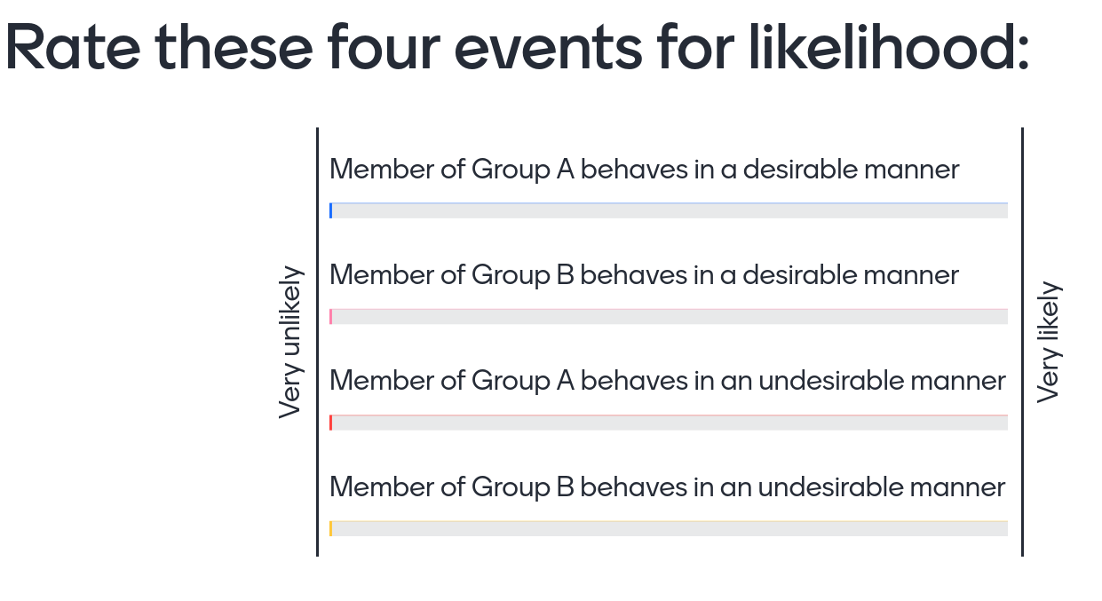
Students work individually. Each student views a series of positive and negative statements about members of two groups, displayed by the class leader. The slides are available here.
The students then rate the likelihood that members of the two groups engage in desirable and undesirable behaviours, using a mentimeter poll - example format. The results of the poll are not shown to students until all have completed.
Post-activity mini-lecture
Class leader reveals results of the study. The calculation you’ll need to do here is as follows:
-
Work out the goodness score for Group A (desirable - undesirable). e.g. 6.8 - 2.1 = 4.7
-
Work out the goodness score for Group B e.g. 6.5 - 2.5 = 4.0
The extent to which one group is favoured over the other is the extent to which these two scores differ.
The expected result is that Group B (which is smaller), will be seen as less good.
Leader then reveals the table of desirable/undesirable behaviours versus group membership, and points out the desirable/undesirable ratio is the same for the two groups, but that one group is smaller. Makes some connections to e.g. real-world prejudice but mainly emphasises the ubiquity of the effect and the importance of producing these kind of contingency tables and looking at ratios (This will set up chi-square-like comparisons for future modules).
Source materials
The web-based activity was created using the RPres format support by RStudio. The relevant files, which you can find in the github repository, are:
irr-corr.csv
irr-corr.Rpres